The Wake Magazine is a bi-weekly, student-operated art, culture, and social commentary publication. I took the challenge of redesigning the website from scratch. I implemented an updated user interface and information architecture based on user research and usability testing.
the challenge
How might we better organize the magazine’s content and update the user interface without losing the wake mag’s unique essence?
the solution
A completely new website design that focuses on making our content easy to access for new and returning users, while also maintaining the strangeness of The Wake.
card sorting tests
I conducted various hybrid card sorting tests with The Wake’s authors, readers, and first-time users. This allowed me to have a better understanding of how the magazine’s users understand and categorize information.
before/after
organizing the front page
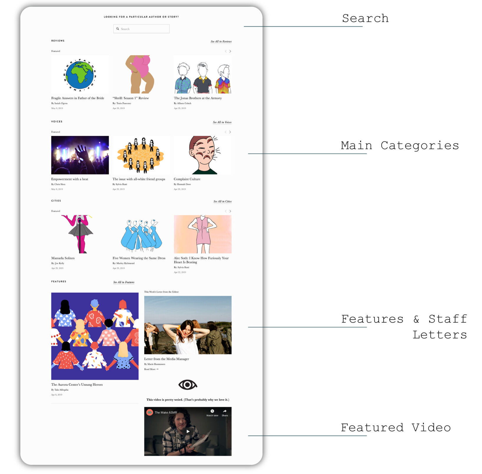
The original home page was busy and unorganized, finding categories was complicated for most users.
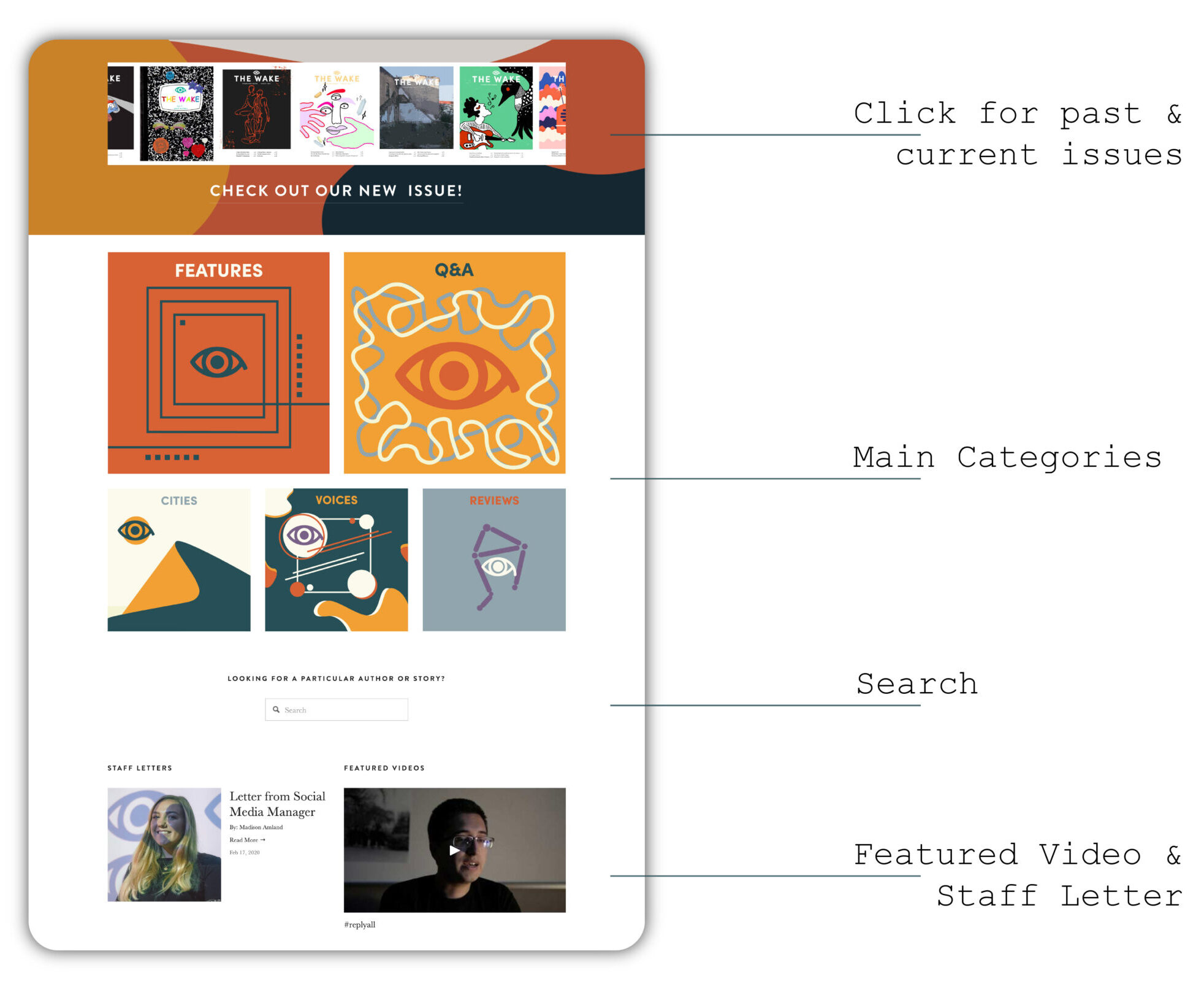
The updated home page includes direct links to the year’s PDF issues, as well as clearer article categories.
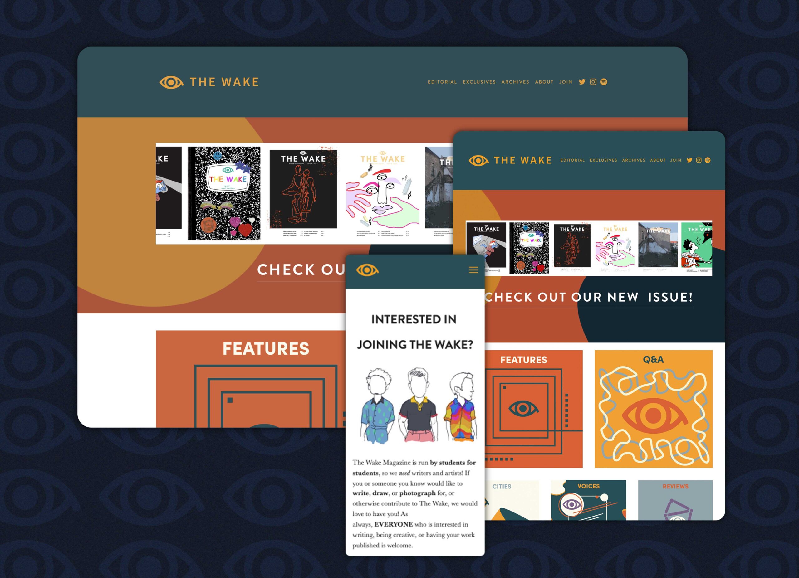
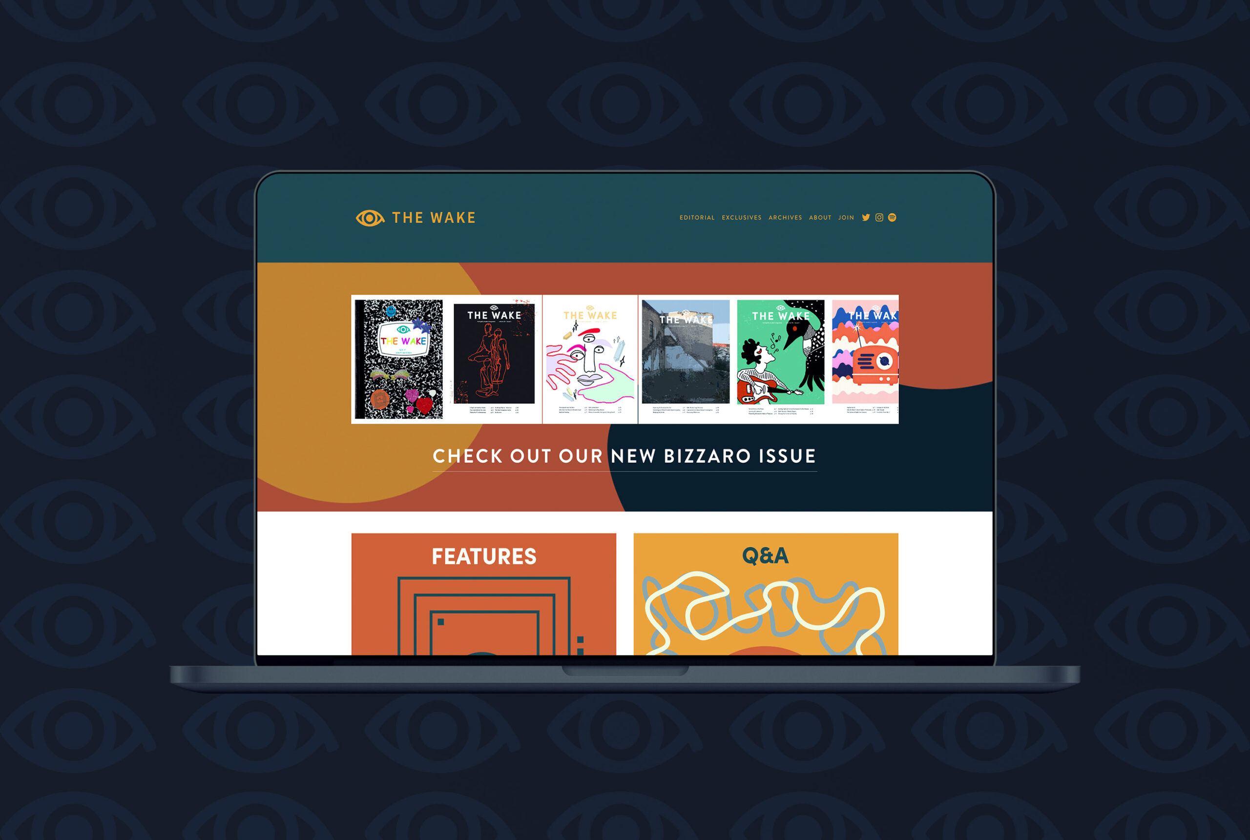
final website
Once a final direction was chosen, the resulting website features an updated user interface, information architecture, and branding. The new color palette allowed me to improve the website’s accessibility.
reflection
I decided to join The Wake during my senior year of college as a challenge to step out of my comfort zone and to work with various types of creatives. Although the position duties were to posting articles online and solve minor problems, I saw it as an opportunity to redesign a website and have a positive impact on more than 2000 weekly readers. Working on this project was exciting, even though it started as a side project while in school.